This is one of the most entrancing books I have ever held in my hands. I put it like that because it is really is delicious to hold. It is smallish, as my comparison shows, but is by no means a miniature. It also delights in the tall format that has been a great favourite of mine for as long as I can remember.

It is an edition, published by Macmillan in 1896, of Christina Rossetti’s weird and haunting poem, Goblin Market. The wood engravings were designed by Laurence Housman but were actually engraved on to the wood, and with the greatest skill, by his sister Clemence Housman.

A quick glance shows that the artist was not just doing a number of pictures to be handed over and popped into the publishers’ book by a workaday printer. Rather, it is clear that Housman was entirely responsible for every single detail of the book’s design and physical make-up (even though it was never anything other than a ‘trade edition’) and contemplation of this fact and the wonderful result of such ‘oneness’ of purpose has been a tremendous inspiration for my attempts to ‘go and do likewise’ at the OSP.
The richly gold-blocked cover, front AND back, makes the book, as it nestles in the hand, seem like some rare decorated treasure . . . but the repeated pattern is actually straightforward and ‘wholesome’ rather than over-wrought and leads seamlessly into style of the imagery within.

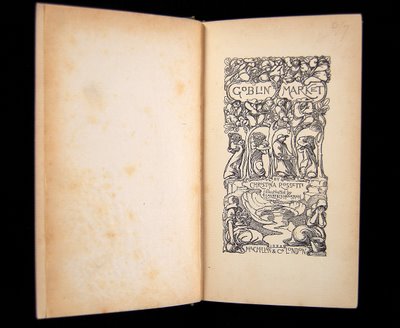
The titlepage is deliciously detailed but it is the next opening – the first page of the text – which takes my breath away and seems to sum up all that I am trying to bring to our books.

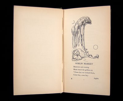
How daring . . . just the title and four lines on this page but with an image which seems to sum up completely the atmosphere in which the story is to be told in the same way that a painted gauze can prepare the audience for what an opera or ballet is about to describe. The image is not particularly large of course but it has been completely released from any box-shape or framing square. Its energies rush out and inhabit all of the space offered by that whole spread. Sun and sickle moon we see . . . and think of Samuel Palmer, the other Ancients and all the tradition down to the Neo-Romantics whose work I love so much. Almost a cliche already, but I don’t care!

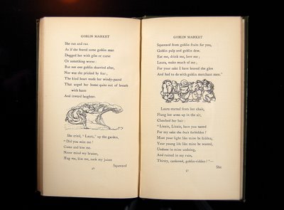
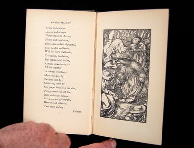
Through the book there are a number of single page engravings (which face a page of text) and a number of small vignettes which punctuate the text, as you can see above. Most amazing of all, though, are the pairs of mighty engravings which are separated from each other by the book’s gutter but which actually form a single image.


Nicolas, the book is lovely but your sheep-and-swan photos are terrific. There must be a way to make a fine book out of so many of your marvellous photographs. Perhaps polymer plates made from the photos? Of course they would become something else but who knows?
Is Frances back from USA? How did it go?