Frances had a very good (if totally exhausting) time at the Royal Academy Exhibition. I went up on the last day, met some great people and scooped her up with all the stuff and drove back home. I would love to say she could then rest but there was (and still is as I write!) the little matter of wrapping up and sending off parcels containing all the books that were ordered.
It really does, though, seem a good time to talk about something completely different!
When faced with much typographical design today, especially of a commercial nature, I tend to get very humphey about bright young things who, finding that there are three hundred fonts in their design package, proceed to use every single one of them in a half-page ad.
I, as you may have noticed, almost always stick to one font (even eschewing Bold, which I hate) for any particular book and, although I have in my printing office many cases of carefully rescued printers flowers, rules, borders and so on, I almost never use any of them. For me, my favourite two colons and a space, used to divide something from something else, eg.
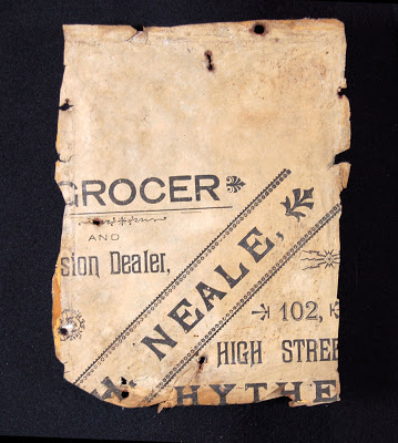
The fruit salad approach so often to be found nowadays is not however restricted to the computer age . . . as this little offering demonstrates.
I had obtained a small picture (can’t remember what) in a very grotty frame. Clearly this needed to be changed. Among the bits and pieces backing the picture was this small and incredibly flimsy slip of paper.

It could have been scrumpled up in less than a second and tossed away along with the other bits of grotty frame. Happily my eye focussed on it . . . just in time.
This piece of everyday Victoriana could have been some sort of poster or flyer but I feel it was more likely a paper bag or sheet of paper for wrapping purchases in. What is clear is that it constitutes a really fascinating piece of printed ephemera.
I love to imagine the compositor rushing with his composing stick from his stone to this case, and then that one and then yet another!
Give the photo a click and have a good look. At the last count, I found SIX different typefaces and SEVEN different rules and ornaments . . . all on half of a paper bag!

The thing about this wonderful scrap is that, despite the superfluity of fonts and decorations it still looks ‘right’. I’m with you all the way on the wordprocessor/desk top publisher who fills up their page with as many fonts as possible. However, there is a certain ‘rightness’ about the way this looks which must be to do, surely, with our expectations of what design from that period should look like. Anyway, it’s certainly a fun piece to find in the back of a frame. Callum.